This questionnaire supports you in planning your modernization.
Tell them what you are planning and they will give you the right information for the realization of your projects.
Personalized and constantly improving.
📣
📖
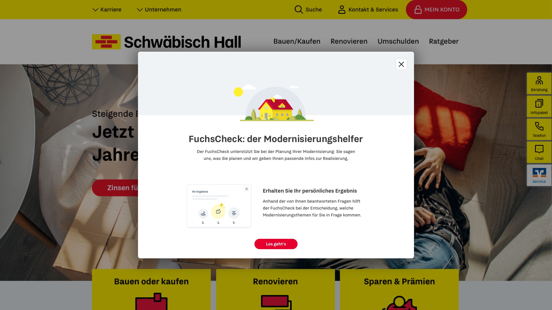
To actually understand the users and their specific needs, we created different personas based on the two main audience types: real estate buyers and modernizers.
So we started with Empathy Maps and worked out the basic needs.
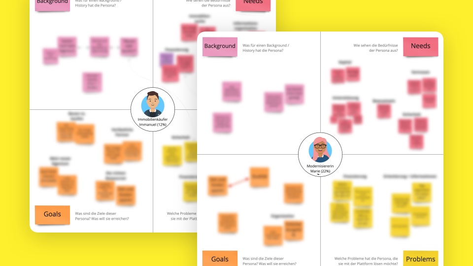
Next, we dove deep into the process of financing and created two different user journeys, spanning the full path from getting the idea to invest to actually receiving the funds to buy or build a house.
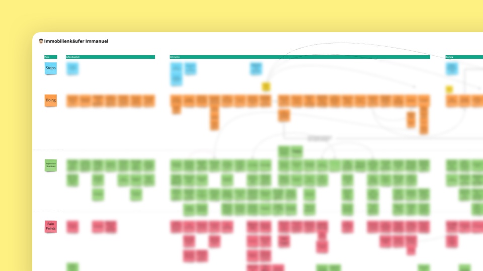
After analyzing their journey, we discovered all the possible pain points users have to face and created an overview of over 80 issues. For an MVP though, we couldn’t go forward with developing a solution for every single one of them, so we started to cluster and prioritize them. Down to eleven major pains.
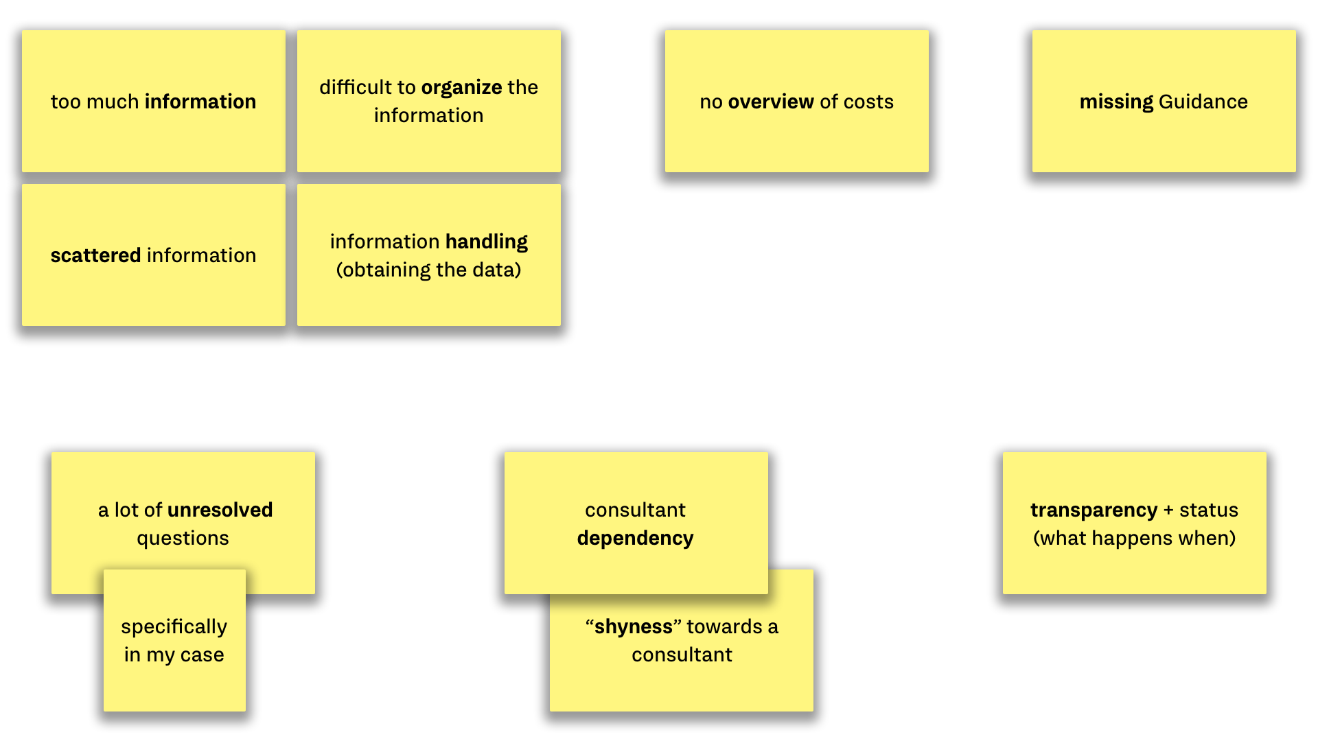
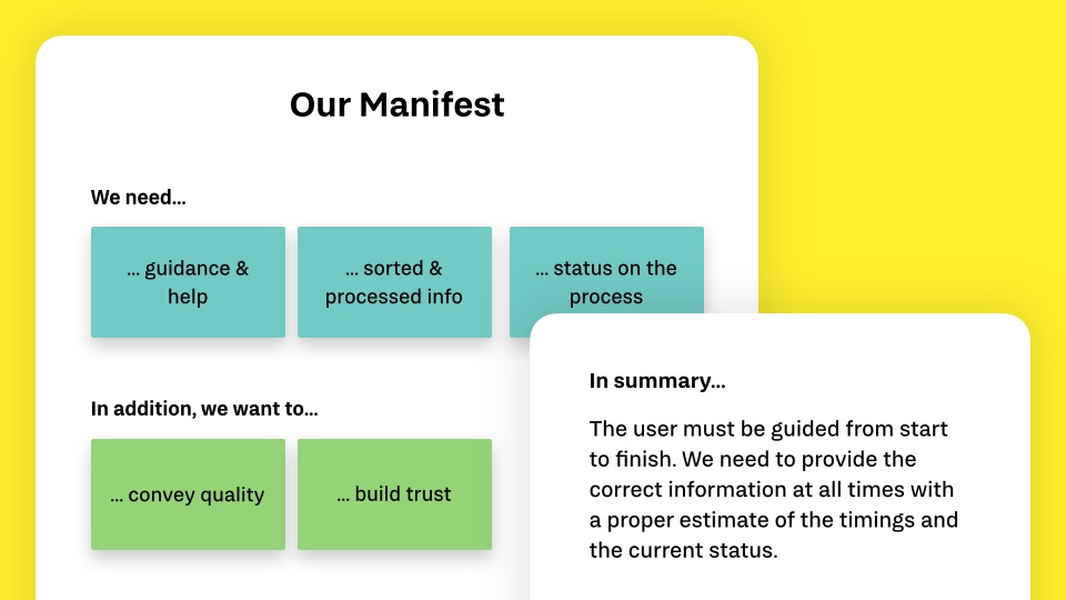
To always know throughout the project where we needed to focus on, we developed Needs Statements for every major pain point, created How Might Wes, and wrote a manifest as our north star.
To get an overview of the current state in the financing and banking area, we made a Competitor Analysis of five different competitors. We created this benchmark to identify potential opportunities and find ways where we can pay more focus to.
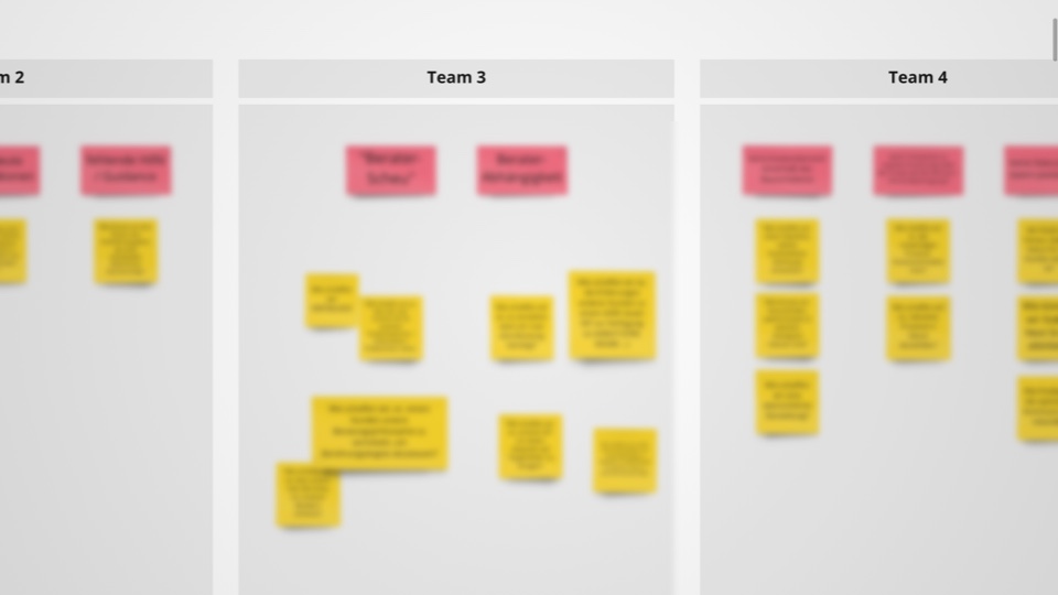
To actually start brainstorming ideas, we turned all the pains into How Might Wes. Questions like “HMW provide a simple way for Marie to get started?” set the stage for our ideation session workshop where we aligned stakeholders with the current progress and internalized their expertise information.
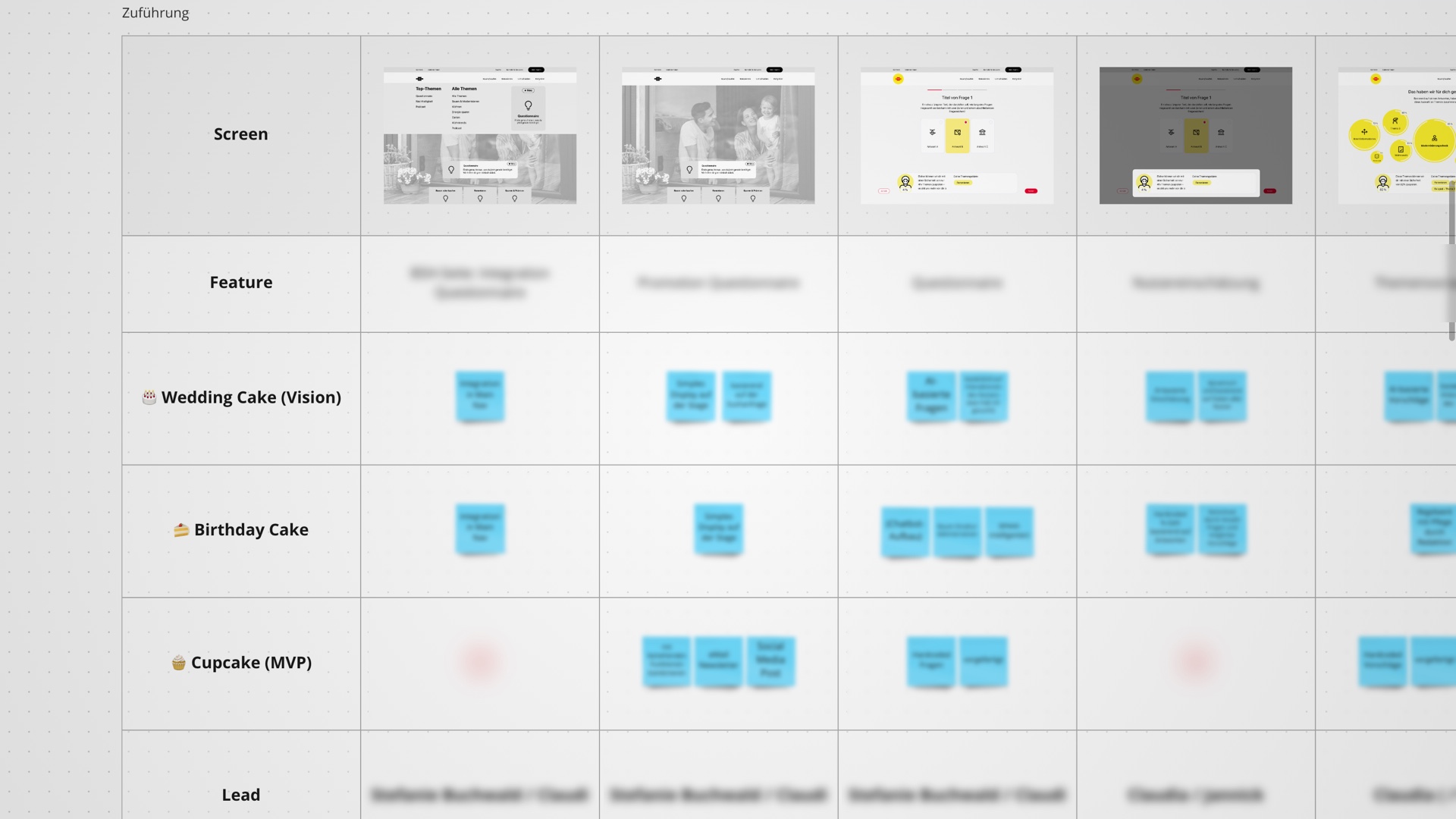
After we gathered all kinds of ideas and knowledge, we summarized the info and visualized initial features for our big vision. After a first prototype we worked out an MVP together with our SMEs in a second workshop.
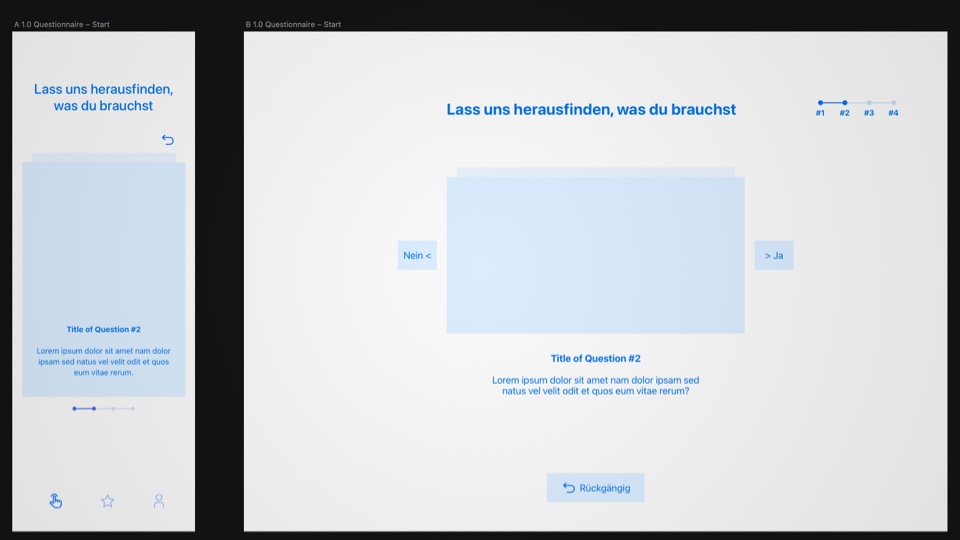
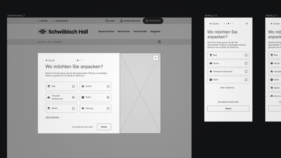
With our users needs in mind and our planned MVP approach, we crafted first concepts on how to fill the needs of guiding the user and providing them with the most important information they need right now.
One of the final concepts was to ask our users a few basic questions to get just the right amount of information to display the proper next steps on what we recommend our users to do.
After creating the designs we also developed a prototype for testing with users and gather feedback to improve our concept. At the same time, a team of developers created a first database with the 4 questions and all possible answers to live-test the functionality of our system.
The final step for us as designers was to enhance this questionnaire by eliciting emotions through delightful animations and transitions. Users should feel that this is the right place to get all the information they need by building trust and empathy.
… to create a flow that is easy to understand and simple to use but provides just the information the users need with a clever system working in the background.
Communication with the customer was very important to us, as was creating sufficient transparency. This creates a team that sticks together. Everyone should have the feeling of being heard. Sometimes there were things that we communicated straight away, sometimes we first made a few variations and then showed our suggestion or set the direction in order to avoid unnecessary discussions.
Without a proper roadmap with a defined MVP, there is a possibility of getting lost along the way, so we developed artifacts accordingly very early on. These have helped us to keep our feet on the ground when making important decisions, such as “Do we do it this way or do we prefer this way?” or “How much time do we still invest in this?”.